Wednesday, May 3, 2017

Final Analysis and Reflection

My final piece was inspired by Pablo Picasso's Blue Period work, in particular one piece called The Old Guitarist. Picasso's pieces from that period have a monochromatic blue color palette to create a flat figure. In his works, the figure was the focal point usually without an obvious context. 
My piece uses Picasso's monochromatic blue color palette. Mine has some greens mixed in as well. I used the pastel to create a soft texture. Though the majority of the piece is a soft texture, I incorporated some strong lines to create depth and play with different textures for clothing and flesh. I also used chalk pastel on Bristol Board rather than oil paint on canvas. In addition, I used Photoshop to create an Ipad playing the video game Guitar Hero and a large Guitar Hero guitar. The shape of the original piece was a traditional canvas, but mine goes beyond the rectangle to create a unique irregular shape. The man's head is almost horizontal in relation to his neck and is the focal point of this piece. The eye path goes from his down to what he is looking at and then to the right towards the guitar and finally down towards his foot at the bottom of the piece. 
Since Picasso’s Blue Period pieces, do not have an obvious story line to them; I wanted my interpretation to have an obvious one. Therefore, my guitarist is playing an intense game of Guitar Hero using his Ipad. This intensity is emphasized through his head facing right towards the screen in his lap. Like Picasso’s other Blue Period work, this man is having a private moment, but instead of having one reflecting on life’s struggles, he is occupied with a video game. Having a video game replace a real musical instrument adds a feeling of fake commercial product placement. This is emphasized by the fact the figure and piece go beyond the original rectangular borders. It is commenting on society’s concept that bigger is better and how technology isolates us. Adding the photoshopped elements changes the tone and message of the piece. Instead of playing a guitar alone creating a melancholy and depressed vibe, the man is alone playing a video game creating an altered intensity to the piece.
 I have greatly enjoyed this class! It has been informative and interesting. Previously, I had only focused on traditional drawing, such as a still life, but now can say I have created work in a range of styles. If I had not been assigned to create different styled art, I could have easily stayed in my comfort zone. In addition, it was interesting to learn about my artist in depth and create a piece inspired by his work. By having this background knowledge, I am now better able to understand the significance of his pieces. I look forward to my future art classes at Loyola!

Monday, April 17, 2017

Postmodern Mixed Media Project Visual Analysis

The medium for the piece was paint, ink, and printed images on Bristol board. The composition is balanced by using a triangle shape. The focal point of the piece is the photoshopped collage of famous classical portraits that forms the inside of a mouth. When looking at the piece, one's eye travels from the focal point side to side similar to the shape of the larger painted smiling lips. I edited the printed collages so that they are highly saturated to give then an almost glowing appearance. In addition, these images are primarily composed of warm colors. The chosen color scheme is complementary colors. The chosen complements are orange-yellow and blue, red and green, and purple and yellow. The painted lips are similar to the lips on the printed collages in regards to shape and color. Though unlike the printed lips, the painted lips have more purple tones incorporated within them to follow the complementary color scheme. In addition, following the color scheme, the skin tone has orange-yellow tones within it. The skin tones colors are not as saturated as the lips because the lips are the focal point. The ink surrounds the bottom part of the painted lips to create a three-dimensional more modern effect and shadow. When hung, the ink makes the piece appear rounded so that there is even more depth.

The piece is inspired by Jean Baudrillard's quotation, which states, "Americans may have no identity, but they do have wonderful teeth". To further explore this concept of lacking identity, I chose to utilize renowned portraits that many people, even those without formal training in art, will likely recognize. The artificial saturated colors of these portraits make them look bleached like the fake smiles posted on top of each one. These model perfect smiles exemplify Americans "wonderful teeth".  Suddenly with the same perfect set of teeth, these once distinctive masterpieces lose some of their overall uniqueness. Together, these edited portraits form a collage that acts as the "teeth" of a larger mouth. The larger lips are a similar pink color to the printed out lips. Having them the same color creates a uniformity making the portraits appear less original and unique. There are no eyes that go with the painted nose and lips making it appear like a mask that anyone can wear. The mask represents how the American identity has become like a cookie cutter, almost manufactured. In addition, it comments on the fact that Americans values are skin deep. This mask has no identity, but it will give the one who wears it a pair of perfect teeth.

Wednesday, March 29, 2017

Postmodernism Readings

"A Pair of Boots" By Vincent Van Gogh
Based on the three readings on Postmodernsim, the post modern age is the blending of the world's cultures. Today, people no longer live in a world with one set of morals, customs, and culture. Instead the world's cultures are "intermixing like a smorgasbord in a earthquake" (Postmodernism Introduction 3). It is normal to understand and be exposed to a variety of cultures from our own. In fact, it is difficult to imagine a world where you only know your own culture. The integration of technology, such as the internet, has contributed to this "intermixing". People "[attempt] to map the contours of our rapidly changing Postmodern world" (Postmodernism Introduction 4). According to Jameson, there are three cultural periods, the first being the age of realism, then the age of modernism, when individuals expressed dissatisfaction with their world, and finally the age of postmodernism in which "cultural forms reflect the dislocation and fragmentation of language communities" (Postmodernism Introduction 6).
I found it particularly interesting when Andy Warhol's "Diamond Dust Shoes" and Vincent Van Gogh's "A Pair of Boots" were compared. While Van Gogh's shoes represented the peasant class's poverty and misery, Warhol's represented "depthlessness with no link to any reality" (Postmodernism Introdcution 7). In addition, Warhol's shoes, when compared to Van Gogh's, appear flat due to the black and white color scheme and angle. As Jameson states, Warhol's image displays "a new kind of superficiality"(Jameson 9). After looking at both images, Van Gogh's painting conveys a larger message about the struggles of the peasant class, while Warhol's represents the commercial, materialistic focus of the culture.

"Diamond Dust Shoes" By Andy Warhol
Postmodernism focuses on hypereality, which is found in places like Hollywood or Disneyland. Disneyland is located in California where, according to the Jean Baudrillard, "all Los Angeles and the America surrounding it are no longer real, but of the order of the hyperreal and of simulation" (Baudrillard). This hyperreality "is not the unreal, but has replaced 'reality'" (Postmodernism Introduction 58). Disneyland is an example of this where "the real is no longer real" (Baudrillard). In a culture obsessed with perfection, I do agree with the larger idea that the United States has become a hyperrealistic nation overall. Instead, like Los Angeles, it is full of "fabulous proportions, but without space or dimensions" (Baudrillard).  The Postmodernism movement reflects the increasingly interconnectedness and changes of the world today.

Monday, March 27, 2017

George Kubler Reading Response

I found two parts of the George Kubler reading particularly interesting. The first was when Kubler discusses the history of and limitations of artist biographies. One such limitation is how these biographies "confine the value of the history of art" in a way that makes it "easy to overlook the continuous nature of artistic traditions" (4).  According to Kubler, these biographies are"confined" in this way because the biographer's goals are solely focused on the particular artist's life and his or her works. I had not previously thought about biographies in this light before. I found Kubler's metaphor comparing using the life of an individual artist as way to study the history of art to that of accurately describing the railroads of a certain country helpful. It makes sense that focusing on a single artist's life as a way to explain art history is too narrow just as would be studying one railroad traveler.
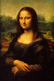
Another section of the reading that I found particularly interesting was the section discussing the terms "talent" and "genius". In my own life, I have noticed how people immediately associate famous artists as being geniuses who have almost superhuman amounts of talent. Kubler argues that this is not the case, but that an artist's "entrance and position in sequence" are as influential as his or her talent (6). Kubler cites a few artists to support this idea. One is Leonardo da Vinci and another is Bernardino Luini. The fact that Kubler does not need to even mention da Vinci's last name for the reader to recognize who he is referencing supports his argument. Kubler explained that Luini was talented just like da Vinci, but "came late when the feast was over" (6). If I were to show the two photos pictured below, people who know very little about art would probably recognize the piece on the left as opposed to the other piece. 


Kubler describes modern views of the idea of genius as being a "congenital disposition" instead of "a fortuitous keying together of disposition and situation into an exceptionally efficient entity" (6). When I read that, I thought about Hollywood and how there are so many actors and actresses that are just as talented as the A list celebrities, but have not had the same luck. Kubler's points about an artist's biography and how famous artists did not solely possess talent stood out to me and made me think about how I had been previously viewing these two ideas in my own life.

Wednesday, March 15, 2017

Blog Post: Escaping Flatland/The Art of Data Visualization

Both the chapter, "Escaping Flatland", and the video, The Art of Data Visualization, discuss the power of displaying and conveying information using different visual techniques. The chapter addressed, how though as humans we live in a three-dimensional world, we are presented with two-dimensional data on paper or a screen. In the reading, I found it particularly interesting when it described a specific type of data visualization referred to as "stereo illustrations"(17). These illustrations "deliver vivid three-dimensional scenes by means of paired images (one for each eye), which are then fused mentally by viewers" (17). This reminded me of a toy (pictured below) I had when I was younger that was a viewfinder that used this type of illustration to give two-dimensional images depth.
https://s-media-cache-ak0.pinimg.com/originals/5d/70/64/5d70641432949ed1bbf4f8f6cca3a8d6.jpg
In the Youtube video, they discussed how data visualization's beginnings were showing information through cartography and later with science. Galileo's own depiction of the sunspots he saw is an example of this science. In addition, during the video one individual lays out three aspects to keep in mind when creating data visualization. The first of these being you as the creator, second the audience or readers with their own biases and unique backgrounds, and finally the data itself. One image that displayed during the video particularly stood out to me. It was the image below of the distances to the nearest McDonalds in the United States. I think this image, though simple, is incredibly powerful and shocking. Lastly, I liked how in the video one individual discusses what makes these visual displays of data successful. They specified how successful data visualizations convey a story and make complicated information into something more simple and able to be interpreted.  After watching this video and reading the chapter, I became much more aware of different data visualization techniques I have encountered in my own life.
http://www.datapointed.net/2009/09/distance-to-nearest-mcdonalds/

Monday, February 27, 2017

Whitescapes

Tissue on Piece of Poster Paper with Overhead Lights On

Same Tissue and Poster Paper with just a Lamp Turned On
The top photo is a white tissue on top of a white piece of poster paper under my room's ceiling lights. The white tissue is lighter than the paper and appears more like what one would consider the color white to look like. The poster paper behind it looks like a light shade of brown with some possible yellow undertones. Even the tissue does not appear as white as it did against a different color background.
The bottom photo is of the same white tissue and poster paper under a different light. This light was from my desk lamp without my room's ceiling light on. The poster paper looks like it has some pinks in it as apposed to the browns and yellows from the previous picture. The tissue does not stand out as much against the background in this light. It is interesting how two objects that when looked at separately appear white suddenly completely transform when paired together and put under different lighting.